- State three problems facing sheep farming in Kenya.(Solved)
State three problems facing sheep farming in Kenya.
Date posted: August 15, 2019. Answers (1)
- Account for the high population of sheep in Australia.(Solved)
Account for the high population of sheep in Australia.
Date posted: August 15, 2019. Answers (1)
- State five reasons why sheep farming is receiving government support in Kenya.
(Solved)
State five reasons why sheep farming is receiving government support in Kenya.
Date posted: August 15, 2019. Answers (1)
- Give three attributes of Commercial livestock farming.(Solved)
Give three attributes of Commercial livestock farming.
Date posted: August 15, 2019. Answers (1)
- What has led to the sound economic position of Mwea Irrigation scheme?(Solved)
What has led to the sound economic position of Mwea Irrigation scheme?
Date posted: August 15, 2019. Answers (1)
- Outline the steps followed in cultivation of paddy rice in Mwea.(Solved)
Outline the steps followed in cultivation of paddy rice in Mwea.
Date posted: August 15, 2019. Answers (1)
- Explain the factors that have led to the increasing demand for fresh fruits and vegetables in Kenya.(Solved)
Explain the factors that have led to the increasing demand for fresh fruits and vegetables in Kenya.
Date posted: August 15, 2019. Answers (1)
- Explain how the following climatic factors influence crop farming in Kenya.(Solved)
Explain how any two climatic factors influence crop farming in Kenya.
Date posted: August 15, 2019. Answers (1)
- List five problems facing cotton farmers in Kenya.(Solved)
List five problems facing cotton farmers in Kenya.
Date posted: August 15, 2019. Answers (1)
- Discuss how cattle ranching contributes to the economy of Kenya.(Solved)
Discuss how cattle ranching contributes to the economy of Kenya.
Date posted: August 15, 2019. Answers (1)
- Explain the social conditions prevailing in Makka when the prophet (p.b.u.h) was born.(Solved)
Explain the social conditions prevailing in Makka when the prophet (p.b.u.h) was born.
Date posted: August 13, 2019. Answers (1)
- State lessons that a Muslim can learn from Sheikh Uthman dan Fodio.(Solved)
State lessons that a Muslim can learn from Sheikh Uthman dan Fodio.
Date posted: August 13, 2019. Answers (1)
- The graph below represents the climate of station X. Use it to answer the questions that follow.(Solved)
The graph below represents the climate of station X. Use it to answer the questions that follow.

(a) Describe characteristics of the climate represented.
(b) Explain ways in which vegetation in the station adapt to the climate.
(c) Students carried out a field study on soils found on the station represented.
(i) State four soil characteristics they would look for.
(ii) Explain how they would use the following methods to collect data.
- Content analysis
- Observation
Date posted: August 13, 2019. Answers (1)
- Students of a school in Rift valley carried out a field study of an area affected by faulting.(Solved)
Students of a school in Rift valley carried out a field study of an area affected by faulting.
(i) State four importance of having a pre-visit of the area.
(ii) Give three advantages of using observation to collect data.
(iii) Give five importance of learning Geography through fieldwork.
Date posted: August 13, 2019. Answers (1)
- A group of students carried out a study on wind effects in an arid area.
(Solved)
A group of students carried out a study on wind effects in an arid area.
State follow – up activities they may have made.
Date posted: August 13, 2019. Answers (1)
- Name indicators of global warming.(Solved)
Name indicators of global warming.
Date posted: August 13, 2019. Answers (1)
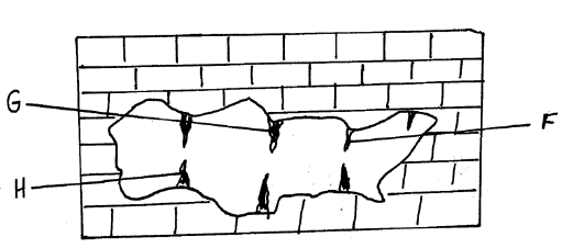
- Study the diagram below and answer questions that follow.
(Solved)
Study the diagram below and answer questions that follow.

(i) Name the features marked F, G and H.
(ii) Give two characteristics of limestone rocks.
Date posted: August 13, 2019. Answers (1)
- Define the term “Earth’s rotation”(Solved)
Define the term “Earth’s rotation”
Date posted: August 13, 2019. Answers (1)
- Form four students from Mihu school set out for a field study on Karst scenery inKilifi District. Why would it be necessary to carry out...(Solved)
Form four students from Mihu school set out for a field study on Karst scenery in Kilifi District. Why would it be necessary to carry out a pre-visit before the study?
Date posted: August 13, 2019. Answers (1)
- List surface features of the karst landscape.(Solved)
List surface features of the karst landscape.
Date posted: August 13, 2019. Answers (1)